The new Harry Potter book is already the fastest-selling book of the decade, but it may also turn out to be one of the most accessible. Large-print and braille versions of the book are already out, and a “dyslexic readers’ edition” will be published next month. Does this herald a new age of dyslexia-friendly printing?
People with dyslexia are used to the usual strife of tiny text, narrow margins, and blinding white paper – all of which make it harder for us to read.
But what will the dyslexic readers’ edition of Harry Potter and the Cursed Child look like?
Out next month, the printing will feature blue text printed on a beige, slightly thicker paper. The letters will be larger, the margins will be wider, and a simple sans serif font will be used throughout.
This dyslexic reader is very impressed! The special edition addresses many of the factors that add to dyslexic visual stress when reading.

What’s particularly striking is that the measures are more common-sense than revolutionary. In the last few years, there’s been a trend towards reinventing the wheel, using special dyslexia fonts to make books accessible. But, the truth is, all dyslexic readers really want is a few reasonable modifications.
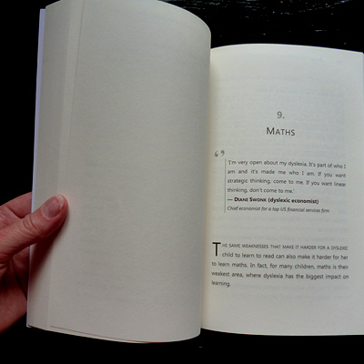
When I was formatting for publication my own book, Defeat Dyslexia!, I was very clear that I wanted the paperback edition to be as dyslexia-friendly as possible.
Coloured text may be beyond the scope of an average print run, but I was easily able to accomplish the following without incurring any additional print costs:
- Sans serif font
- Wide margin
- Large font size
- Cream paper
All of this raises the question: why not make dyslexia-friendly modifications the norm, rather the exception?
What do you think? What books do you wish were available in dyslexia-friendly format? Let me know in the comments…


Leave a Reply